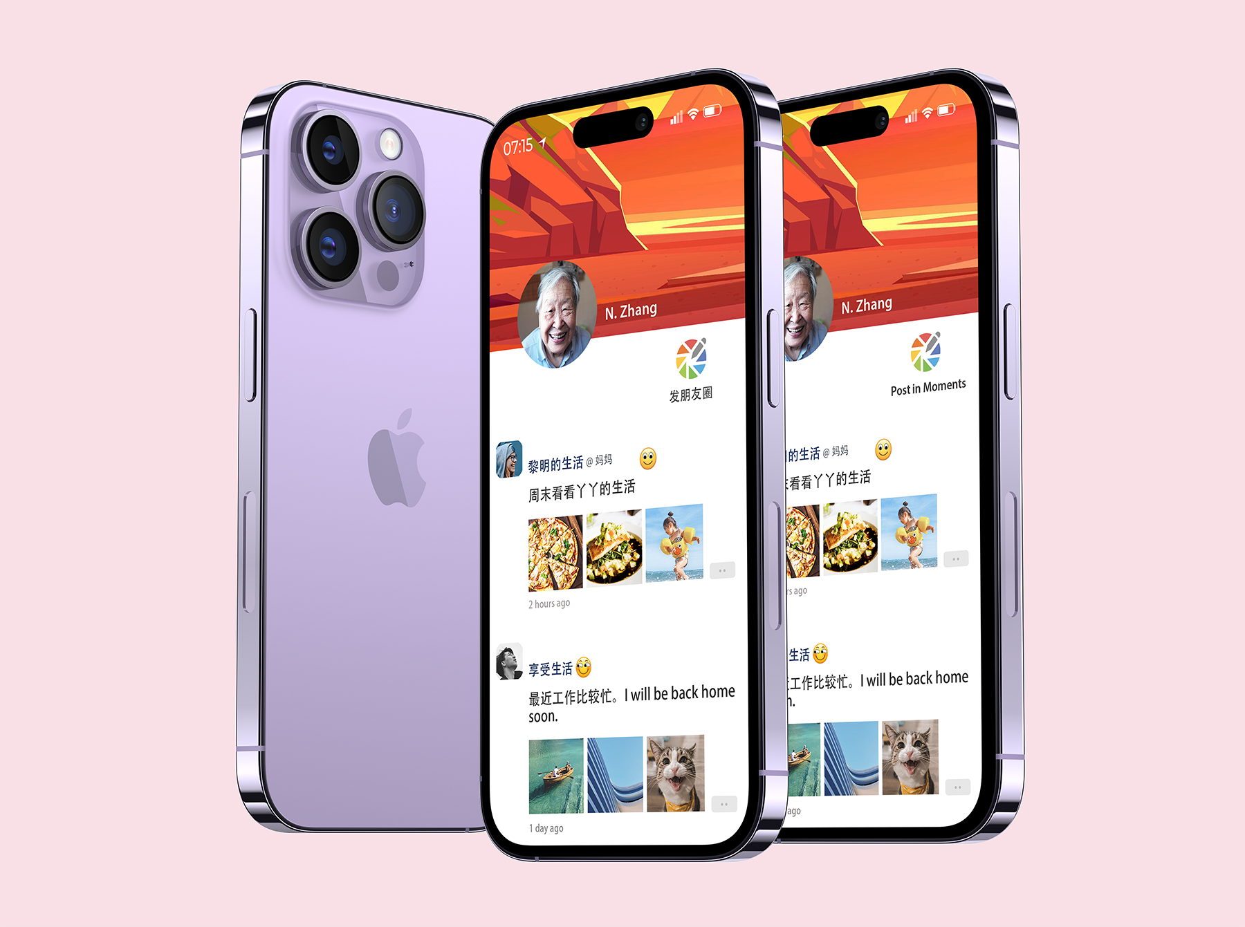
The “Moments” Icon design for Social Media WeChat
Icon design is not measured by its visual effect but by its message delivery to viewers. The semantic distance for icons is the major factor that decreases older adults’ ability to recognize their function (McDougall & Curry 2007). To prevent misunderstandings of icons, Chisnell (2015) suggests that the images and symbols in icons should be task-relevant.
The images below show the redesigned icon, a high-fidelity mockup, and a photo-realistic mockup for “Post in Moments” feature in WeChat, a social media platform popular among older adult users in China. I aimed to make the “Post in Moments” icon task-relevant by creating a camera shutter icon with an integrated pencil, which conveys the function of uploading photos and adding text. To enhance the aesthetic quality and visual unity of the icon, I followed principles of icon design, such as using a grid system, consistent stroke weight, corner style, and key shapes. I also added a label (Chinese and English version) to improve recognition for older adult users in China.

![]()

